How We Increased Traffic, Conversion Rate And Revenue By 210% To A SaaS Business
Feeling like there’s nothing else you can do to increase your revenue and conversions? Don’t, because there is always room for improvement, as I am about to demonstrate in this article. I will show you how we got 40% more users on MonitorBacklinks.com how we increased the e-commerce conversion rate by 74% and the revenue by 210%.
Before I start, let me tell you a little about Monitor Backlinks, so you understand what the website target is.
Monitor Backlinks is an SEO tool that allows users to manage all their website’s backlinks, and of their competitors. The tool has a 30 days free trial and we had two types of conversions. One for the users that signed up for the trial, and the second for those that decided to subscribe for a paid plan.
Getting started
We asked ourselves the following questions:
- Is the website intuitive and easy to use?
- Is it clear that we offer a 30 days free trial?
- Do we have tutorials for non experienced users?
- What is the overall user experience?
- How do we ask for user’s feedback?
- What users convert the best?
- Finally, I asked a friend to check our tool (he had very little SEO experience), and tell me if he understands how Monitor Backlinks can help him.
As you can see, most of the questions were related to the user experience and usability.
Analyzing the current traffic and creating a plan
When your goal is to increase your website’s conversion rate, you will first have to analyze the data you currently have. For that, we checked Google Analytics, and also the messages received from our users. These are some of the things that we discovered immediately:
1. Our bounce rate was close to 62%. This gave us a clear signal that there was a lot of confusion about the tool. Many did not understand how useful the tool can be for their business and left from our website after viewing just one page. To decrease the bounce rate we had to offer more information and tutorials for non experienced users.
2. Next, we checked the messages received from our users. There were many questions, asking very simple things like “How do I start?” or “How the tool can help me?”. This was another sign that our visitors were confused.
3. From my experience, I know that a blog is crucial to any business. It’s a great way to drive relevant traffic, and conversions. Monitor Backlinks blog had little content and did not offer the information the users expected.
4. Our backlinks checker page was indexing all the search queries of our users. Therefore, if a user wanted to check for the backlinks of a gambling website, a page about gambling would have been created on our website and indexed in Google. We found this to be a potential threat to our search engine rankings, so we prioritized this for a fix.
After a few days of analysis, we decided that these are the things we have to concentrate on:
- Make the user understand more about the tool, by creating more content and tutorials
- Create a better blog, and write useful articles
- Create video tutorials
- Ask for user’s feedback
- Find a fix for the indexed pages about gambling and adult content
- Make the website load faster
Without any further ado, let me show you what changes have lead to higher conversion rate, and revenue growth.
Homepage changes
Our homepage was converting very well already, so we only had to make a few minor tweaks.
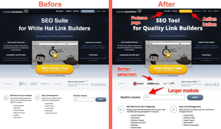
1. We changed the “start free trial” button from blue to yellow, and we have created a “features” page, to which we have included a button on the top menu.
2. Next, we have changed the selection of where our website has been featured, with more relevant websites to the SEO industry. This time, we have used logos with colors. The module was designed to help us gain trust.
3. The last change we did to the homepage was to increase the size of the module “backlinks checker”.
Creating a new blog
We had to change everything on the blog. I mean layout, design and structure. Here’s a side-by-side comparison with the old version and the new one.
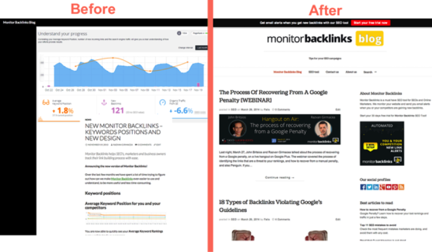
It’s obvious why we prioritized the blog for a change, right? The previous design did not look professional and had a very low conversion rate. So, here are the changes that we made:
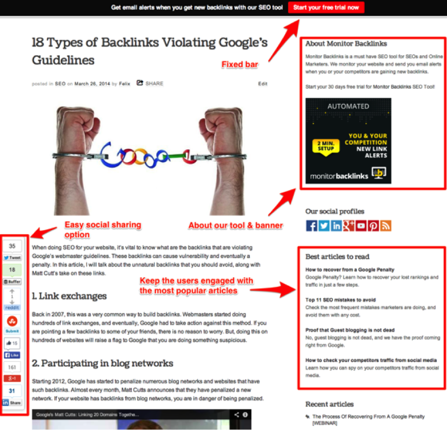
1. On the top of the blog, we have included a fixed bar, with a go to action button. This module has become one of our best converters simply because it’s hard to miss, and it invites people to try our tool for free.
2. On the right sidebar, we have added a module with a quick introduction to Monitor Backlinks.
3. To keep our users engaged on the blog, we have added a module with the most popular articles.
4. At the bottom of each article, we used another actionable button, inviting users to start a free trial.
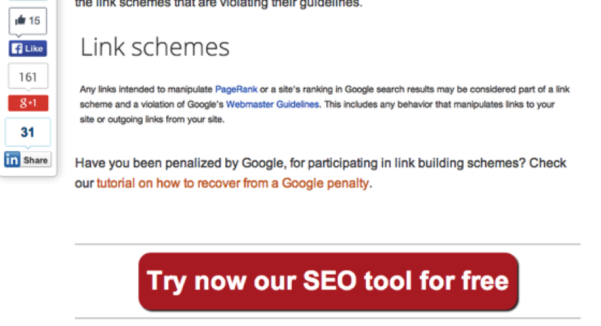
All these changes leaded to 311% more visits and increased our blog’s conversion rate from 0.5% to almost 4%.
Get better conversions
We have made quite a few changes so far, and the results were already starting to show, but why stop? There was still room to make more improvements.
Monitor Backlinks has a 30 days free trial, and we had to find a way to convince the users to subscribe to a paid plan, before the trial ends. During the 30 days period, the user could have used all the features offered by our tool, just as a paid user would be able to do. We decided that we must differentiate the trial version from the paid one.
1. Therefore, we have limited the trial version to see only 40 backlinks for each domain. We were still showing all the backlinks, but we blocked the additional information with the message “Subscribe to view now”. 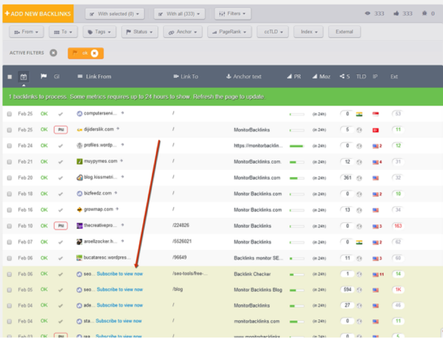
2. We have also limited the user ability to export reports, during the 30 days free trial. 
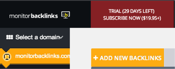
3. At the top of the page, we included a module showing how much time the user has left from his trial.
Increase the user experience
1. To make the user understand how Monitor Backlinks can help, we have created a few video tutorials on how to get started, and a quick tour of the tool. We wanted everybody to have access to these tutorials, so we have added them as a pop-up, right after the user signs up for his trial.
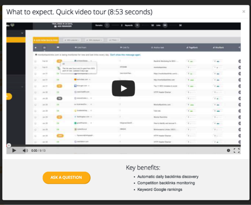
Then, we decided to send these tutorials to all users, via email so they can familiarize with the best practice.
2. Another thing that we have done to increase the user experience was to write more high quality articles and step-by-step guides on our blog, based on the users interest.
3. Last, we increased the website loading speed, by moving the tool to a better performing server. This has helped our website load three seconds faster.
Achievements
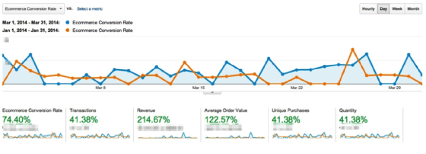
The results speak for themselves. All the changes that we have done in January and February have helped us double our paid users and increase the revenue by 200%. The Ecommerce conversion rate has increased by 74%. Below is a screenshot comparing January with March conversions.
And this is a screenshot comparing January with February conversions 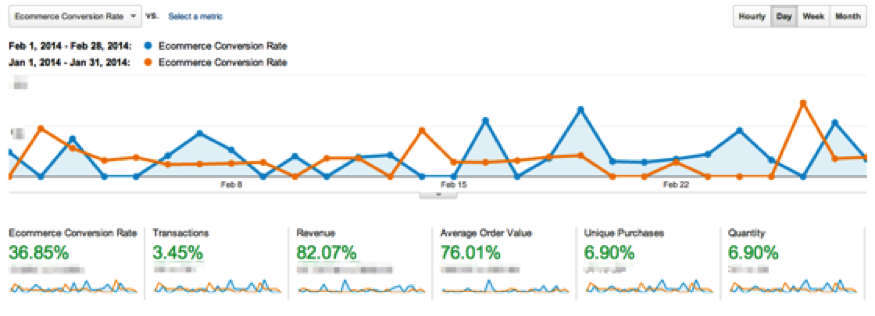
Conclusion
To find new opportunities to grow your conversion rates, you have to put yourself in your customers place. Try to understand what they would like to see on your product, and how you can improve it.
Asking for user’s feedback is necessary for any business. You can do this via email or by using survey forms on your website.
This is a short summary of what worked best for Monitor Backlinks:
- Create a blog with actionable buttons.
- Create step by step articles, guides and video tutorials.
- Study user behaviour and find what is missing
- Force your users pay for your services, instead of giving everything for free.
- Create the best user experience possible. Everything must be intuitive and very easy to use.
- Never stop improving.
